Teacher
Richard is a talented full time artist, who loves painting and teaching.

with Richard Robinson
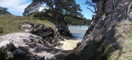
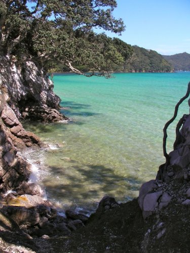
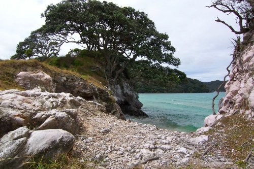
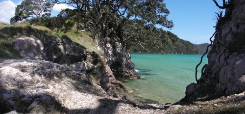
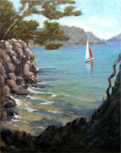
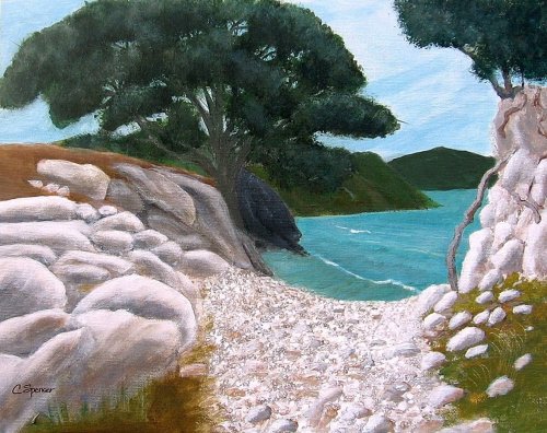
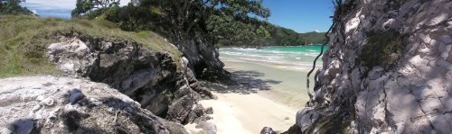
Get started in landscape painting with this stunning beach scene. Follow along step by step or use the resource photo to create something more your own. Enjoy!
Whenever you’re ready! The lesson is available online any time, and your access to the lesson never expires.
As long as you need! Your access never expires, so you can come back again and again.
Sorry, no you can’t download the video. This is to avoid piracy. You’ll always be able to view the video on this site though.
Richard is a talented full time artist, who loves painting and teaching.
Hi I’m Richard. I’ve been painting my whole life and back in 2001 I traded my graphic design career for the humble life of a full time artist. I love painting, and as it turns out, I love teaching too.
Nowadays I balance my life between parenting, painting, surfing, travelling and teaching. My work is regularly featured in international art magazines, in galleries in New Zealand and America, on TV and in my Mum’s house.
I give outdoor painting workshops in interesting spots around this beautiful planet of ours and love encouraging people to paint. Two of my favourite artists are John Singer Sargent and Joaquín Sorolla.
My painting website: www.nzpainter.com
I’d love to be your new teacher.

Richard is a master artist with an exceptional skill in identifying and communicating key factors to making successful paintings. I have found his video workshops an excellent resource for improving my own work.
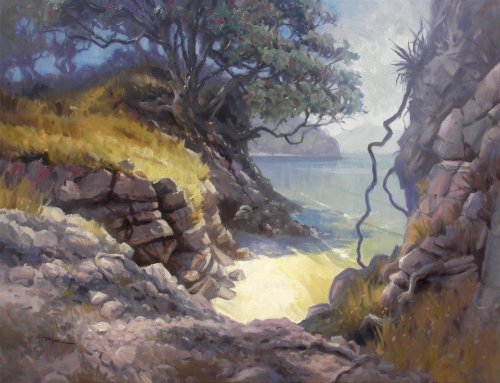
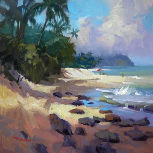
Studio Painting 30x40" Oil on Canvas by Richard Robinson
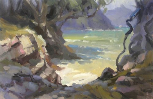
12x18" Plein Air Study - Oil on Canvas by Richard Robinson
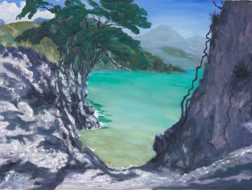
"Pa Bay Great Barrier Island" Water Soluble Oil on Stretch Canvas 18x24 by Barbara Stucki
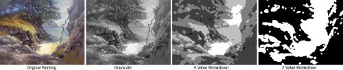
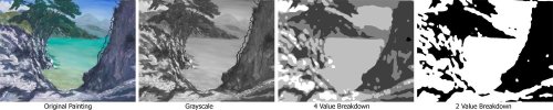
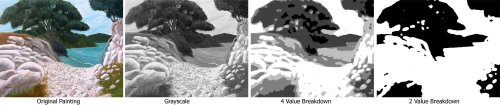
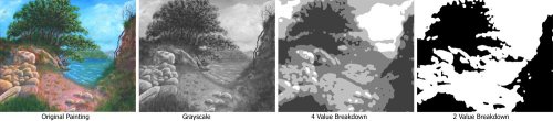
Design I like the design which is quite close to my own studio painting design except that with mine I was careful to add colour interest into all that gray foreground - something that you haven't managed to do which makes the whole foreground look a bit like a desolate moonscape. So the grayscale design itself is good and strong but it would work better with more colour interest in the foreground. Colour That foreground gray would look better with more variation thrown in - like a good salad, lots of colour is yummy. You've tentatively added some warms in there but before you go adding colour in there willy nilly you need to understand where and why the colour variations occur. In my own painting I was concentrating on warm planes and cool planes. Warm planes occur where the warm sunlight hits them directly. Darker warm planes occur where they are tilted towards sunlit areas of rock or sand which are a reflecting their own warm colours into the shadows. Cool dark planes occur where they are turned to the sky or away from the sun, reflecting the blue of the sky. The tree could do with some light thrown on it and the hill behind could have been pushed further back in space by lightening and adding gray/blue to help separate the tree from the background. Brushwork You've used a variety of large and small brushes which is good to see and you've created some interesting texture in the rocks. The water seems to be a little overworked as does the sky and furthest hill, removing most evidence of brushstrokes which takes a bit of the interest out of it. Some waves or wind lines in the water would have helped to add interest there and softening the edges of your distant hill and clouds would have helped push them even further back into space. Realism Except for the few things I've mentioned the realism is pretty good in this piece. The dappled light over the rocks is such a complex subject you've done well to try to paint that at all whereas some people avoided it altogether. You haven't quite managed to convey the effect of a tree casting a shadow - the shadows need to be linked together the same way a tree is linked together. Good try though, and hey, I didn't manage it even in my studio painting either which I spent a week on. The cast shadow on the water is a bit conspicuous too - it should be bluer and the shape larger, because it looks like it's not quite sure if it should be there, and the white foam isn't helping either because it should be a blue grey in the shadow there. Those are pretty minor things though. Good work.
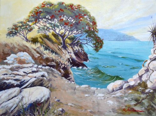
"The Kiwi Christmas Tree" Acrylic on canvas panel. 12x16" by Bob Mitchener
Design Really nice design here Bob - I love the lead in you've created with the large rocks, the positioning of the sun and even the curving wave echoing the other major movements. Couple of minor things I would personally have changed would be the tree kissing the top of the painting and the flax plant cut in half at the right edge. I like to make sure major elements are purposefully in or out of the picture edge - not kissing it which draws the eye to the edge of the painting. You've achieved a nice balance with plenty of movement which is the main thing with this scene. Colour The high key approach you've taken here has added to the sense of peace which is enhanced by the glowing light effect you've added into the sky and tree. Although you've pushed the colour in some areas you've managed to balance those with large areas of grays so the painting hasn't become gaudy, so good work there too. In the water you've achieved a good subtle colour gradation towards the sky but it seems there's a little colour information missing in the foreground water that would account for reflections of the cliffs and transparency through to the sand beneath the shallows. Missing those small colour hints results in the water looking a little plastic. On the whole it's very pleasing colour work. Brushwork Your brushwork is strong and deliberate which is a pleasure to see with a rich variety of marks and textures. I particularly like your use of dry brush and will make a note to explore that more in my own work. Realism You've really made this scene your own and it's clear you've been painting for a good long time and have developed techniques and symbols for dealing with different subjects. There are only a couple of things really hindering the realism here that I can see and those are the somewhat symbolic drawing of the tree and the lack of a strong shadow concept. By that I mean that yes you have creating a clear position for the sun but it's not backed up consistently by the placement of your shadows. For instance there should be a deep shadow area under the tree and also a shadow cast upon the water. Some of the rock groupings seem to be too a light for their position, so you've achieved a high key painting by doing that and an interesting surface but sacrificed a powerful sense of solidity. Concentrating more on your shadow areas will also help unite your masses and strengthen your overall notan design (dark/light design) which is currently a bit fragmented. On the whole it's a great painting though and I hope my comments have been more helpful than critical.
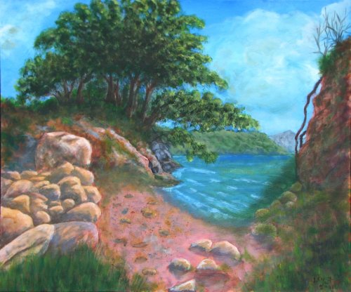
"NZ Beach" 14x11" Acrylic on Canvas by Catherine Spencer-Whitehead
Design I like how you have simplified this scene Catherine and made a somewhat symbolic or iconic artwork. The path to the beach is a bold addition which gives the painting some narrative. The top of the cliff on the right was somewhat problematic in the photo but you have solved that nicely with a tree which also helps to balance the main tree. I think that a shadow across the foreground would have helped to unite the two patches of foreground grass and also would have helped to shape and lend perspective to the somewhat flat path. Colour As with the drawing, you have simplified the colour which gives it a sort of naive charm but also reduces the amount of time it might hold a viewer's interest. If you do wish to begin adding more colour into your work you'll need to spend more time analysing the subtle colour differences found in every object and the way light is reflected from one object to another. There is not one speck of the universe which displays flat colour so let that be your guide. Brushwork Part of your trend to simplify has been to remove evidence of brushstrokes which again removes interest from an artwork unless other factors like detail or colour step in to take its place. What does hold my interest is the detail you've put into the tiny rocks and pebbles in the pathway which is really a delight for the eye. Realism There is no strong sense of light direction here - something that can be remedied with cast shadows, and again the simplified forms lead this piece away from realism, but perhaps that's not your goal. It really reminds me of Giotto's fresco work if you care to google his name. Sometimes by simplifying objects we make them grander - they become symbols of themselves.
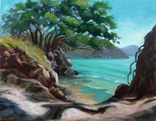
"Pa Beach 2" Acrylic on canvasboard, 65 cm x 54 cm by Leif Jensen
Design The overall arrangement of lights and darks in this painting is interesting and organic but the colour design is what really needs looking at here. Colour I have actually been on a pink beach in Western Australia made up of billions of little pink shells, but it still didn't look this pink. :-) That's really pink! Perhaps you were trying to paint the foreground rocky path which leads down to the beach and yes there are some pinky tones in there, but... mmm. If you want to subdue (gray down) a colour you need to look at adding it's compliment (green in this case) or add a gray to it. To get that transparent look of shallow water you need to think about changing the colour as it approaches the shore - it becomes more like the colour of the sandy bottom the closer it gets. You will see that in action in the demo video. Your greens look very much the same all round like you used a tube of green without mixing it. I can see you lightened the green a little bit in the distant headland but it's still far too green for that distance and needs to be toned down with a blue gray. Brushwork Good to see you trying some different paint application techniques there like spattering, thin washes, impasto and scumbling - good work! As you gain experience you'll gain confidence and that will show through in your brushwork. I suggest you try a few simple small still life studies with a larger brush because once you get the hang of a particular subject it frees your brain to be more confident and expressive with your brushwork. Realism The spacing of your waves are too close together and it's making it look like a long stretch of beach is trying to squeeze itself into a small area which throws the size of everything else into question. The straight regular edge to your rock grouping on the left makes it look more like a garden wall or a damn rather than a natural scattering of rocks. Have a close look at your tree and the tree in the photo and see where your drawing differs. It's all there in front of you but when you're painting it's a case of how many balls can you juggle at once so it often helps to segment your studies into specific areas like drawing, colour, texture, form etc. Depends on your level of self discipline too of course and everyone's different thank goodness.
60.00USD
$45.00USD
$15.00USD
$15.00USD
$15.00USD
Not loving your painting lessons? No worries!
If it’s not the right fit, we’ll give you a full refund within 30 days of purchase - no questions asked.
When you purchase a DVD you also get online access to the same lesson, including any lesson resources like photos, downloadable notes and access to upload your painting to the student gallery.
That's why you need to make a password when you purchase a DVD, so you can access the online content as well. Enjoy!