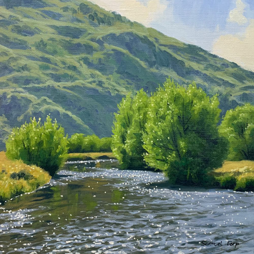
In this chapter, we'll explore the serene beauty of a summer landscape featuring graceful willow trees and a shimmering river under the bright sun. The scene is set with a simple yet effective composition, utilizing an S-shaped curve that guides the eye through the painting, suggesting rhythm and flow. This approach often results in the most compelling landscapes, as it avoids unnecessary complexity. The willow trees stand as a focal point, embodying the essence of summer with their lush foliage. The distant mountains, rendered in lighter tonal values, add an element of grandeur and atmospheric depth, enhancing the illusion of height. Throughout this lesson, I'll guide you in mixing vibrant greens and capturing the play of sunlight on water, all while infusing art theory into our practice. By the end, you'll not only recreate this tranquil scene but also gain techniques applicable to your own artistic endeavors. Whether you choose oil or acrylic paints, this project promises to be both rewarding and enlightening, offering a perfect blend of challenge and enjoyment for your painting journey.
This guide accompanies the full video lesson. The lesson includes the complete narrated video, the printable PDF chapter, and personalised critique support.
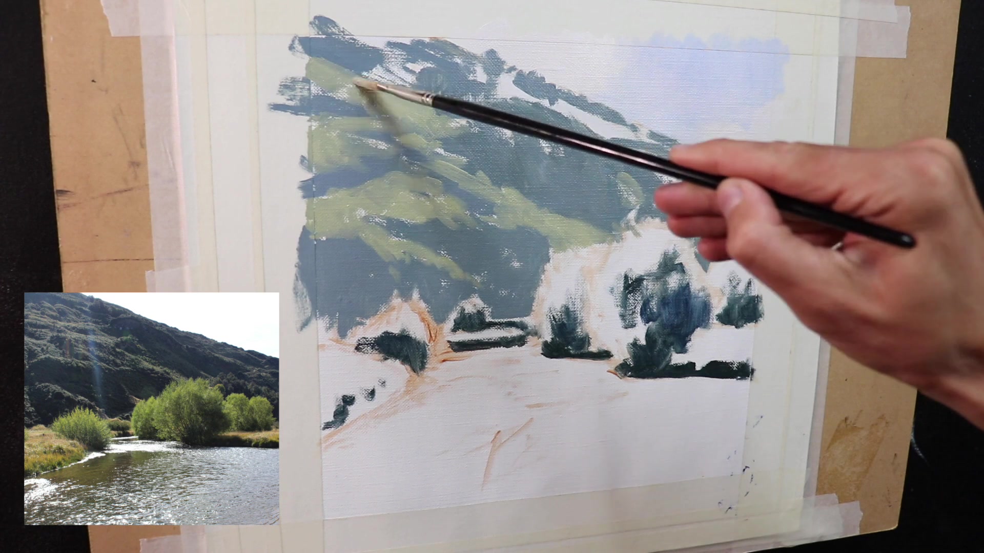
Focus on marking down the main colors and values without worrying about detail. Use loose painterly brushwork to convey aliveness in the painting. This stage is about setting the foundation for more detailed work later.
Paint Sunlit Areas of the Hill
Mix yellow ochre, cadmium yellow, ultramarine blue, a little alizarin crimson, and titanium white to create a green that is not too saturated. This pale green will help the hill sit back in the landscape, avoiding it from coming forward.
Differentiate Foliage Saturation
For the willow trees, use a more saturated green compared to the distant hill. This contrast in saturation will make the willow trees stand out and create depth in the painting. Avoid using the same green for both areas to maintain the landscape's depth.
Mark Light Areas on Tree Canopies
Use a mix of yellow ochre, cadmium yellow, and ultramarine to paint the areas of the tree canopies that are in light. This will help in achieving the right saturation and value for these parts of the painting.
Pro tipUse less saturated greens for distant hills to help them recede in the landscape.
Embark on your painting journey by preparing a stable canvas and selecting your preferred medium. Whether you choose oil or acrylic, ensure your surface is ready for the vibrant colors of a summer landscape. Begin by sketching your composition with a burnt sienna base, setting the stage for a harmonious palette that will bring your scene to life.
As you progress, focus on establishing values and shadows, using ultramarine blue to unify the elements of your painting. Build depth by varying the value scale between foreground and background, and mix colors thoughtfully to achieve natural tones. The key is to maintain color harmony across different zones, ensuring a cohesive and visually appealing result.
In the final stages, refine your painting by blending colors smoothly and adjusting values to enhance depth and contrast. Gradually build up lighter layers to add dimension, and restate shadows to bring out the three-dimensional form of your landscape. Remember to save the lightest highlights for the end, allowing your painting to truly come alive with the brilliance of summer sunlight.
Points to remember
Use a manageable canvas size of around 12x12 inches.
Employ a limited palette to maintain color harmony.
Identify and paint dark values first to establish depth.
Use ultramarine blue consistently for cohesion.
Apply the full value scale in the foreground for contrast.
Mix shadow colors with less titanium white for depth.